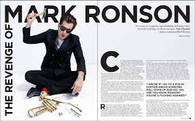
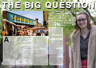
The three images shown below are examples that we have found whilst conducting research for our puff piece. Our audience research told us that our target audience consume magazines produced by Time Out and NME, to work with this data we have used the codes and conventions of these double page spreads and have developed them to fit with our puff piece.
A feature that appears in all three of these examples is the drop quote that is more prominent amongst the text. Research has shown us that this quote is usually from the speech of the person being interviewed. This is used to grip the reader so that they don't brush past the page, a key point can urge them to read the article and find our more. We decided that this was an important part of our puff piece to grab our target audiences attention.

Another feature of these puff pieces is the use of the layout and how the main bulk of space is taken up by a picture. This is done to engage the audience, giving them something more to look at, as writing is not very engaging. We have done this in our puff piece, as the interview is with the director, we have the director (me) standing to the right of the double page spread, smiling, to encourage readers to stop. The colours we have used, unlike the three examples are much brighter and engaging, we believe that by using stronger colours the audience will form a deeper connection with the article.
Using columns is another feature of the layout that all newspapers and magazines use, this is to spread out the text, when it is in paragraphs crossing the entire width of the page, readers are less likely to stop and approach the text becuase it looks daunting and time consuming.

This puff piece is a massive improvement from our drafts because of the way we have used research to shape our puff piece into something more creative, engaging and proffesional.

